Senior Product Designer
Home Content Design Lead
Spotify Home Personalization
Hybrid Home Launched
New components in progress
When I joined Spotify in 2022, the team was in the middle of redefining the Home page towards a new direction. After a rocky start and metrics going red, I had the opportunity to lead using our quantitative learnings, user insights, and design process to shape how we iterated towards reaching our next peak.
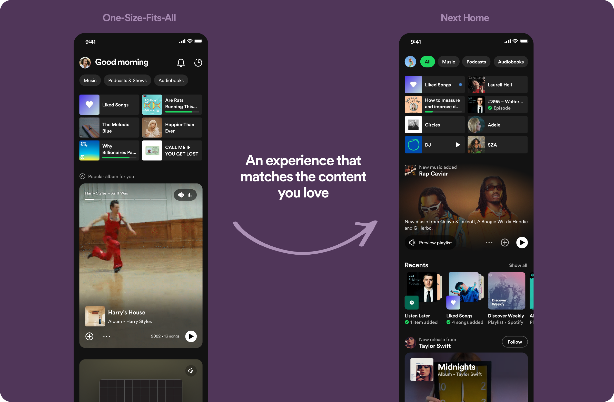
The initial vision (left) and our iteration (right)
The goal of Spotify's Home page is to Guide Spotify users (listeners) to the next satisfying listening session without asking (query-less). We recommend and distribute a personalized content diet that maximizes listeners’ joy while supporting Spotify’s strategic needs
Our strategy is visualized through "The Bowtie":
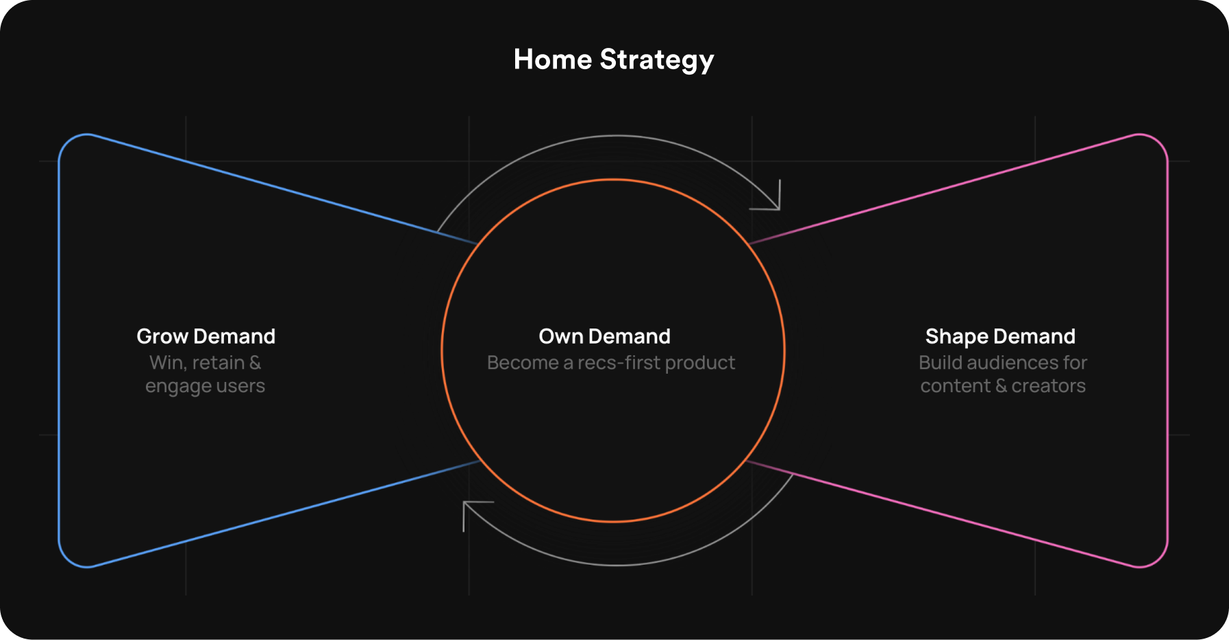
Grow Demand
Win, retain and engage users
Own Demand
Drive consumption from our recommendations
Shape Demand
Build audiences for content and creators
I joined a team in the middle of building out a vision for dramatically changing how users browse and discover content in a feed. Spotify was to become a platform where Culture and Discovery happen, through engaging foreground experiences, helping creators build an audience.
This component presented individual content in a visually immersive manner, enticing the user to discover new content. It also enabled the user to listen to a preview of the content before they jumped into a full listening session. This new component mirrored the new "Tik-Tok" style UI by browsing one piece of content at a time.

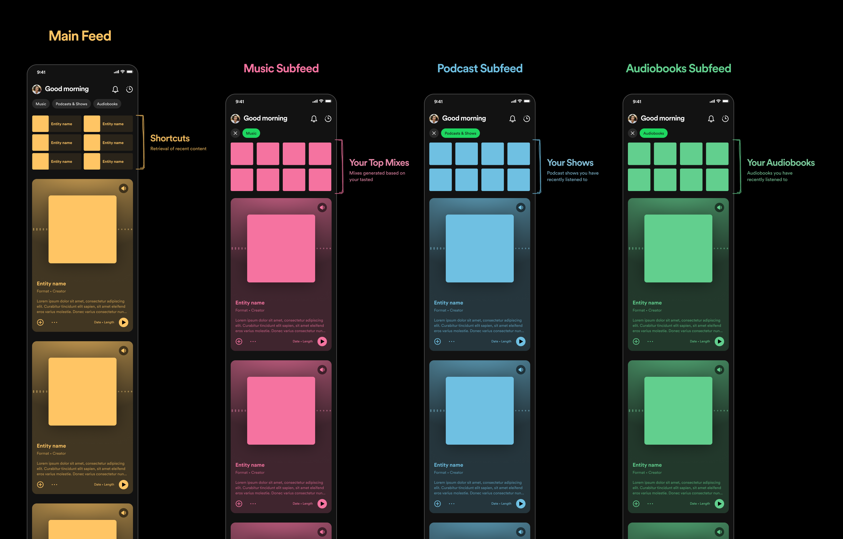
These are other feeds accessible from the tabs at the top that let you deep-dive into a specific audio format. Each feed starts with a format-specific 'anchor' focused on retrieval of familiar/recent content, and is then followed with a feed of 1D Audiobrowse cards focused on discovery of new content.
After much hype and excitement from our leadership (but a bunch of healthy skepticism on the ground), we announced our redesign to the public.
Unfortunately, after 2 weeks we had to dial down the experience. Although we had increased discovery, we had negatively affected our guardrail metrics:
Grow Demand
Home Weekly Active Users(WAU) went down by ~17%. Users weren't leaving Spotify, but they were going to other surfaces like Browse, Search, and Your Library.
Own Demand
Consumption from recommendations (CfR) went down ~3%, as 95% of users weren't scrolling past two audiobrowse cards.
Shape Demand
Podcast discovery and consumption were down by ~1.7%
Other things we noted that contributed to the negative guardrail metrics were:
Usability
Only 9.6% of users were using the Audiobrowse functionality on the cards.
Discovery vs Retrieval
We had swung the pendulum too much towards discovery, and our new Audiobrowse UI didn't meet users' retrieval needs.
Subfeeds
Subfeeds weren't being used—only about 2% of users were driving consumption from them. These feeds weren't discoverable and the value prop wasn't clear.
Clearly we had missed the ball with this redesign. But there was still some good. We had created a new card component that worked well for unfamiliar content; although, we had tried to make it fit all of our content—unfamiliar or not.
We also had established new subfeeds, though weren't being trafficked, could still be used as a fallback to provide additional recommendations. We just needed to work on their discoverability and value prop.
With any redesign, there will be a dip in metrics while we learn how to optimize and iterate on our new foundations. But it's important to not lose momentum and keep climbing to the next peak. The opportunity was clear:
How might we guide Spotify users to their next satisfying listening session by ensuring that our UI and architecture matches the needs of our content and users?
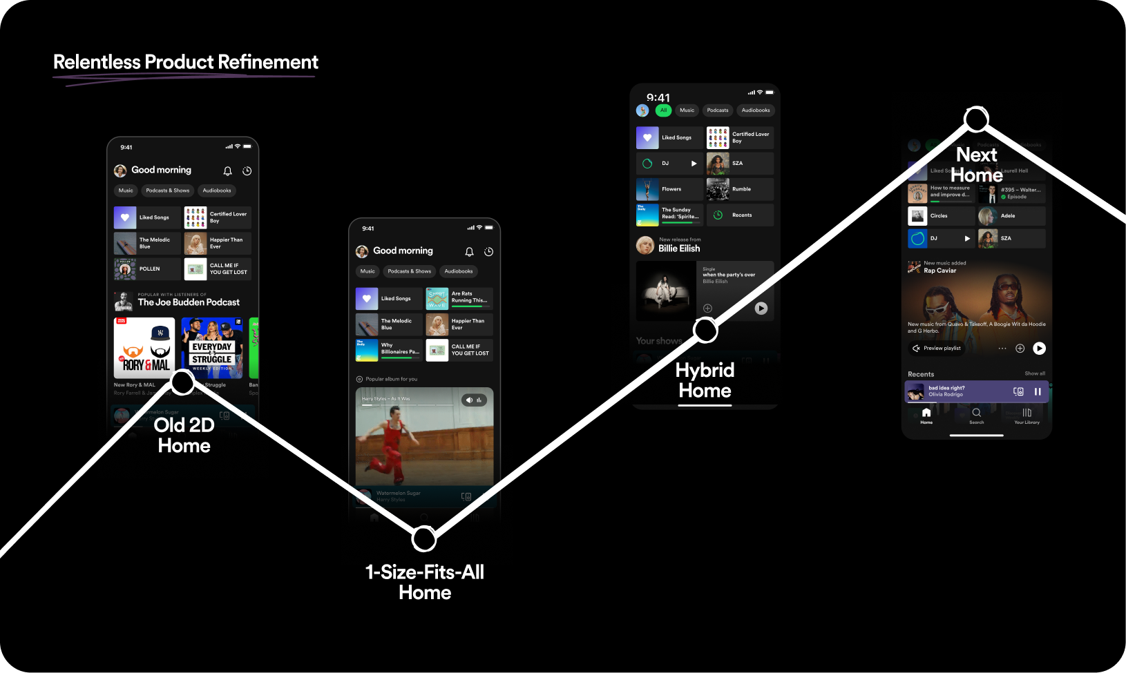
Relentless cycle of product refinement. Once one peak is reached, you must change things fundamentally in order to improve. This change will lead to some losses, but it is necessary in order to learn and reach the next peak.
The work I had been doing at Spotify thus far had been to support the launch of the existing vision and strategy. Now that we had gone through the launch and there had been clear gaps, I was tasked with leading the iterative thinking and refinement.
There were two areas that I decided to spend time on:
We had oversimplified the architecture, leading us to have gaps on the nuances that fit each user and audio format (music, podcast, and audiobooks).
We had believed using just shortcuts for retrieval and the new Audiobrowse cards would work for all our content, but we discovered there were UI needs that these components didn't address.
I worked on these opportunity areas concurrently, but for the sake of the narrative I'll explain them separately.
In order to improve the architecture of Main Feed and the Subfeeds, I had to better understand users behavior towards each content format.
I partnered with my User Researcher to conduct a study to understand our listeners' needs and how they would prefer to browse for their next listening session. We provided 9 participants with audio format-specific types of recommendations (recently listened to, most popular, similar to your taste, recommended by editors, featured guest, narrated by author, etc.) and asked them to construct their own main feed and music, podcas, and audiobook subfeeds. This let us know what they expected to see on each surface and what type of content they were more likely to interact with.
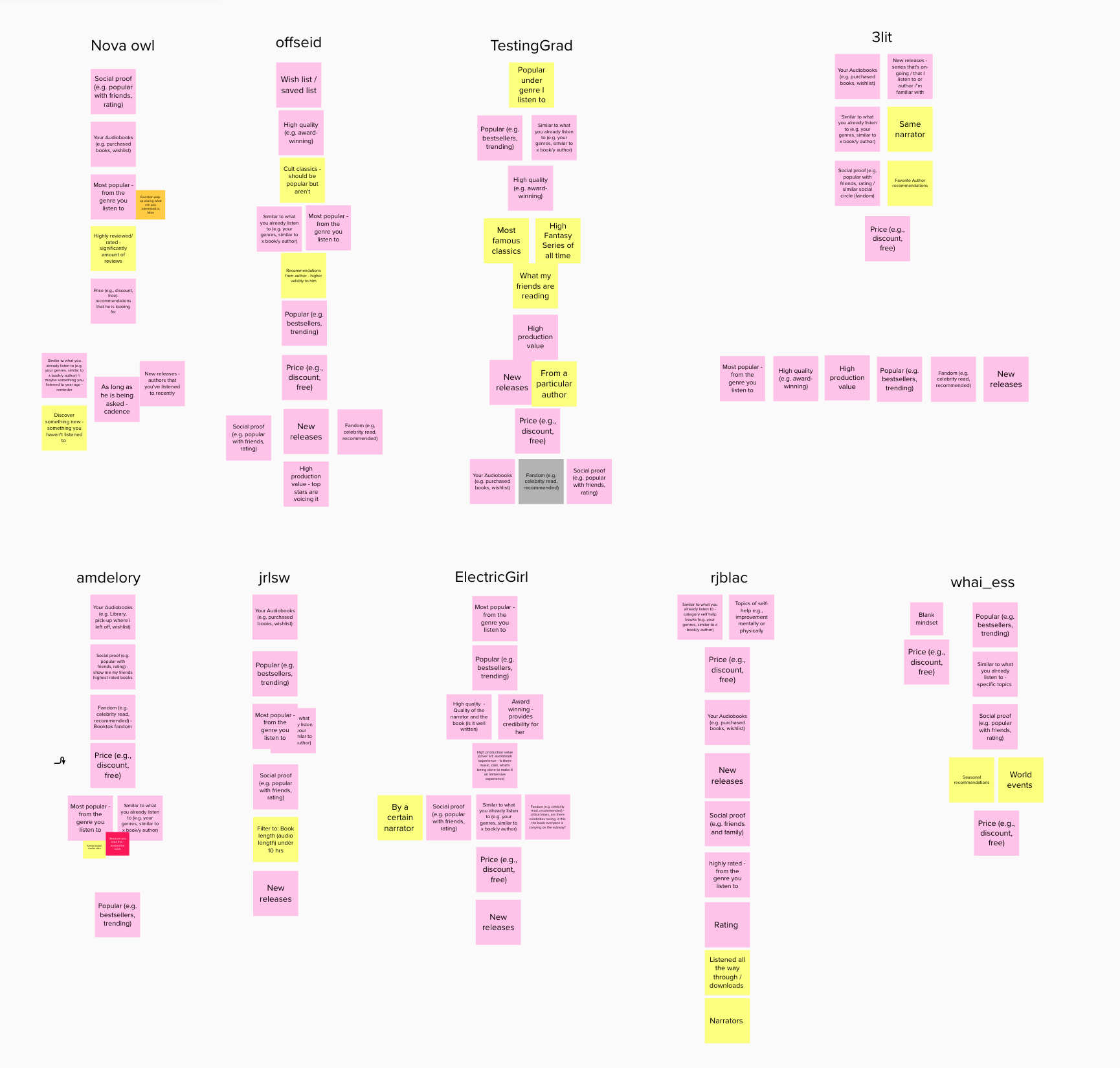
Feedback from participants on how the Audiobooks subfeed should be structured
My researcher and I then worked with our Data Science partner to understand which type of content has performed well within each of our feeds. This would give us insight on what users are looking for and engaging with in our live experience.
With input from User Research and Data Science we crafted some key findings for each of the feeds.
Main Feed
Main Feed is seen as a low effort space that provides content that feels most relevant to the user, with a healthy balance of content you have seen and are familiar with, and content that is new to you.
Music Subfeed
Music Subfeed is seen as a pathway to expanding and deepening taste. It also serves as an alternative to Home—although it only contributes to 0.34% of total Home CfR.
Podcast Subfeed
Podcast Subfeed is seen as a "hub" for talk content that provides reliable access to continue maintaining ones habits (the "Your Shows" anchor attributes to most of the consumption from this feed) and a place to develop new habits when your Main Feed is filled with too much Music content.
Audiobook Subfeed
Audiobook Subfeed is similar to the Podcast Subfeed as it provides reliable access to the users in-progress audiobooks, but it also provides value as a dedicated audiobook destination when the Main Feed is filled with Music recs. Recommendations on what's popular and highly rated are valued highly here.
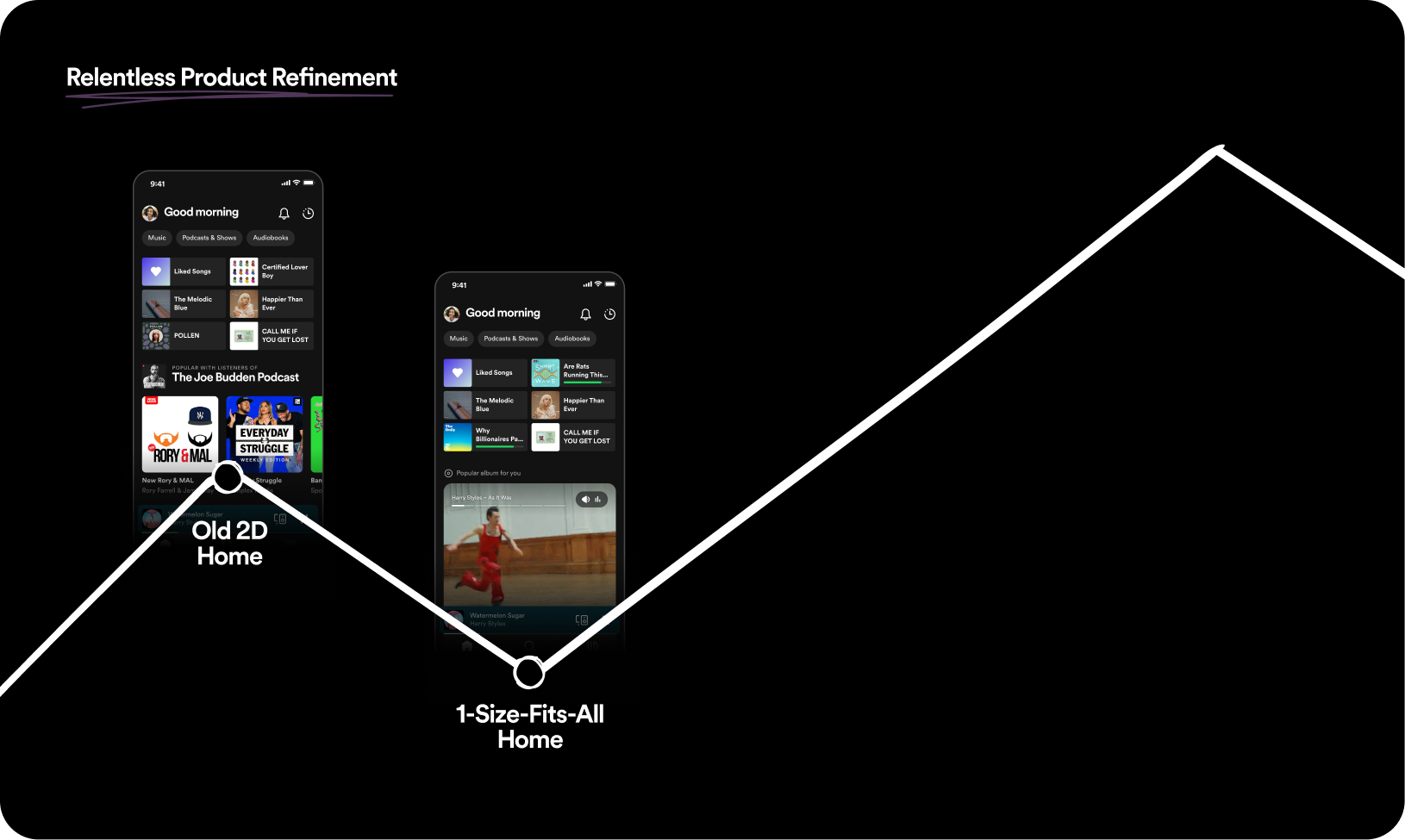
Armed with the knowledge that users needed more familiar content on Main Feed than what we had leaned into previously, I worked with our Product, and Engineering teams to derive the concept of Hybrid Home as a quick way to tactically balance users retrieval and discovery needs.
We increased the number of Shortcuts on Main Feed from 6 to 8.
The first ten slots are reserved for familiar and retrieval content. This content is presented in shelves where density and groups better matched familiar content UI needs.
The next twenty slots are reserved for unfamiliar discovery content. This content is presented through the audiobrowse cards where users can evaluate new content through audio previews and videos.
These changes resulted in Hybrid Home being slightly positive compared to the original 2D Home experience. While this wasn't a drastic jump from where we had been, it allowed us to quickly build a foundation on which we could safely iterate on.
I also used the signals collected from research and insights to iterate on the entrypoint and programming for subfeeds.
First I tackled the discoverability problem in order to increase the number of users finding and entering the subfeeds. I condensed the header and added a default "All" tab that was highlighted in green to draw the user's atention.
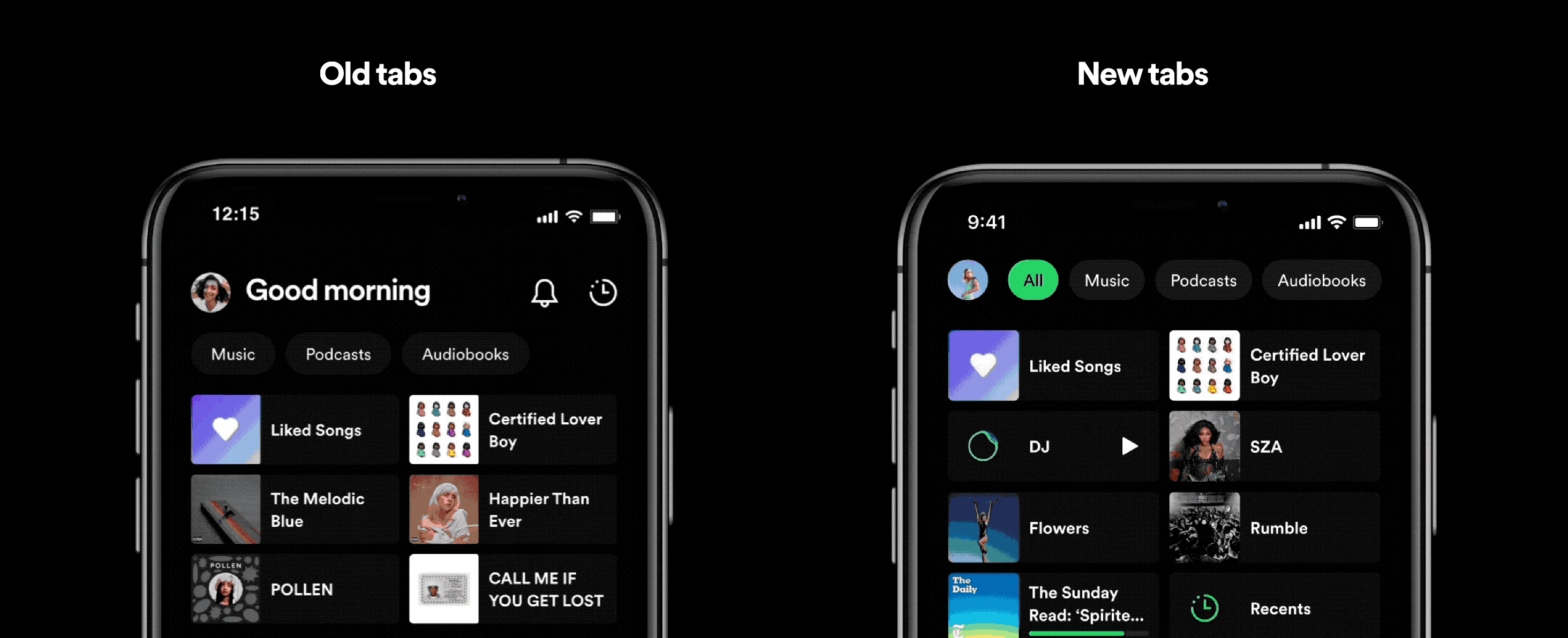
The changes we made to the tabs UI and interaction pattern
These changes resulted in each of the subfeeds seeing between a 50-70% increase in consumption from recommendations.
It also empowered us to more impactfully iterate on the programming strategy for recommendations in each subfeed. I facilitated brainstorms with my Product, Research, and Engineering partners to use our learnings to ideate on new content hypotheses given what tested well with users and what was possible for us to create. This lead to higher retention for all the subfeeds, with Podcast Subfeed especially benefitting from these changes.
Concurrently, I worked on re-assessing our UI component suite. With the 1-Size-Fits-All Home feed, we had applied the new audiobrowse card to every single recommendation we had made. This had not worked as users found the cards too bulky to quickly browse through familiar content or choose from individual content in a group.
In order to understand what UI affordances we needed to provide, we began with trying to understand our content offering better.
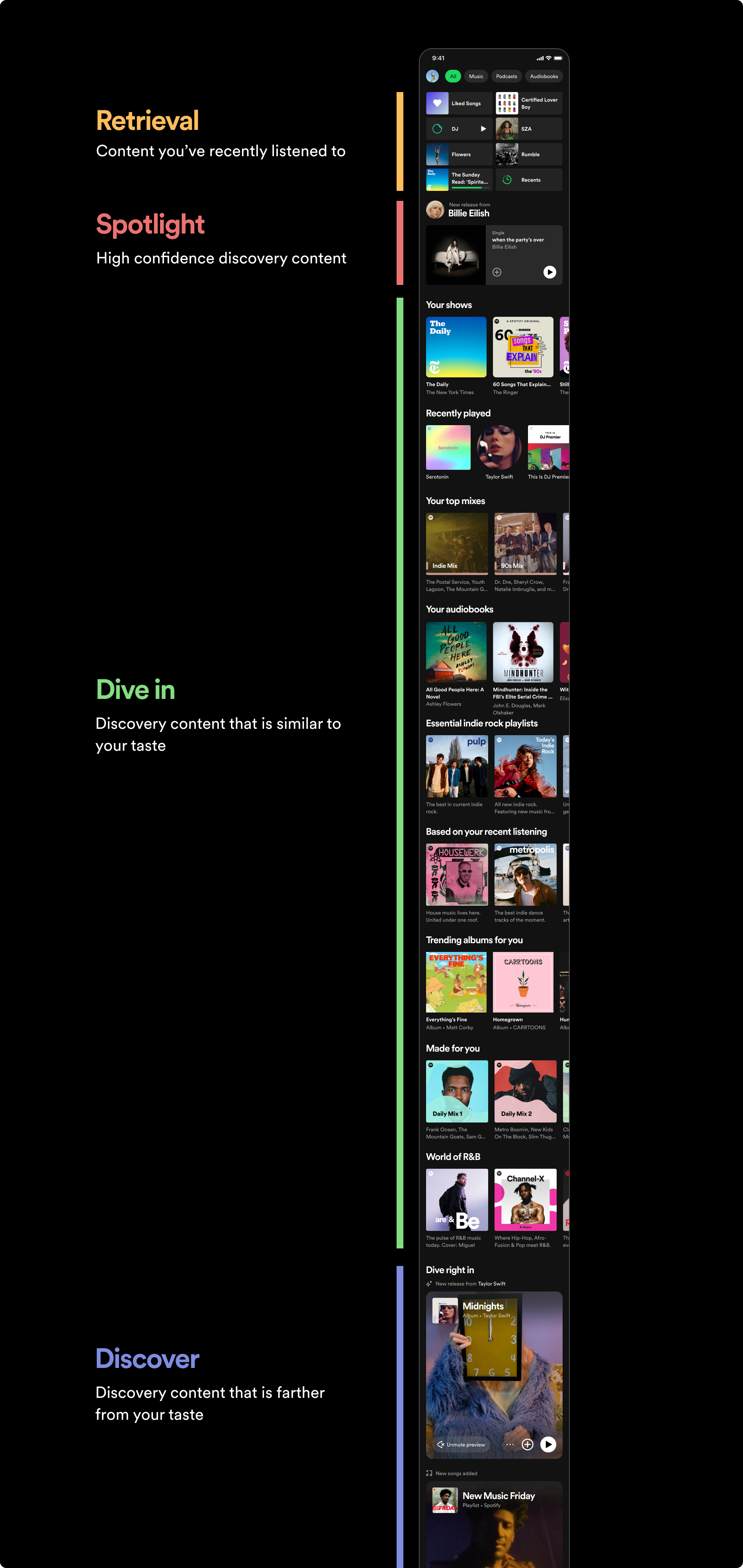
For context, our recommendations are structured as "content hypotheses". Each content hypothesis (ex. "recently played", "more like X", "audiobooks for you", etc.) contain 10 candidates that have been scored and ranked from a much larger pool of candidates based on what we believe you are most likely to listen to. Each content hypothesis can be presented as a shelf by showing all 10 candidates, or it can be presented as a card by showing only one candidate.
I first collaborated with ML engineers to document all the content hypotheses that could be shown on Home. I then worked with my User Researcher to classify them into three groups—Retrieval, Familiar Discovery, and Unfamiliar Discovery.
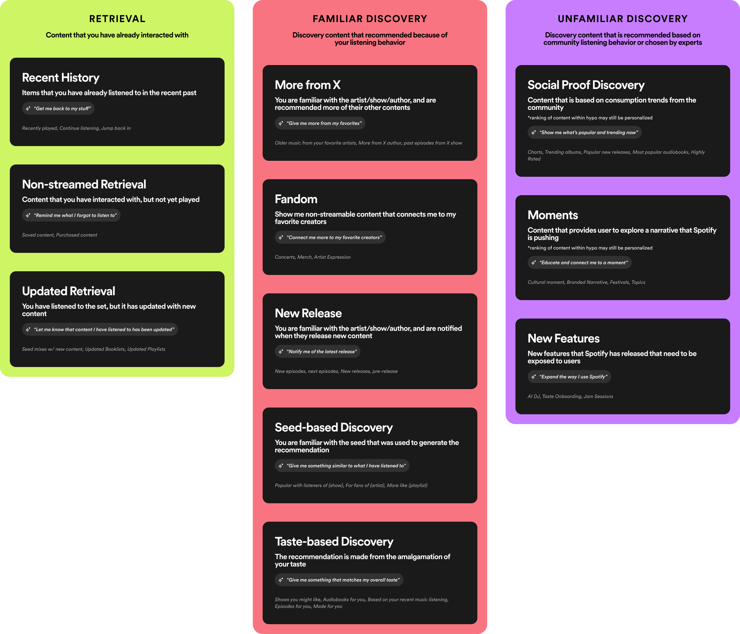
Our content hypotheses classifications
In order to understand what UI would fit each content hypothesis classification, we needed to understand the evaluation needs for each classification.
I worked with my User Researcher to set up a study where we presented participants with content hypotheses that were representative of each classification type. They were then asked what information/metadata was needed to properly evaluate each hypothesis. After that they were asked which UI container they preferred the content hypothesis be presented through—either as a standalone card or in a grouped shelf.
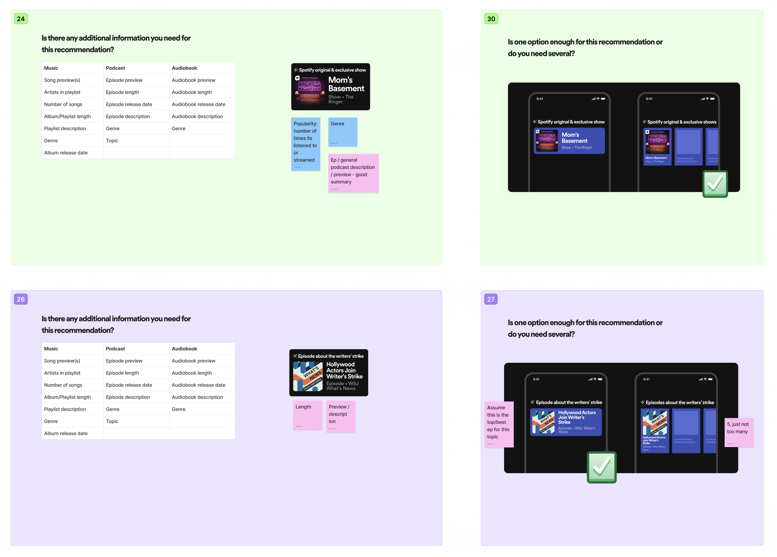
Example of what was shown to research participants
From the research we gathered several key learnings.
For retrieval, users simply needed to identify the content through the artwork and title. Features like audiobrowse and descriptions are not needed.
In order to effectively evaluate, users indicated they preffered to compare recommendations against eachother within the content hypothesis.
We need to provide optional audiobrowse previews for discovery content.
We should reserve the 1D Audiobrowse card for moments where we want to highlight a timely piece of content (ex. new release from your favorite artist, a cultural moment, a trending topic, etc.).
I patnered with a visual designer to perform a competitive analysis on what components were being used by other music and video streaming services in the industry.
From this we iterated on existing components and ideated on new ones to come up with a suite of components that we felt was exhaustive without being overwhelming. I mapped these to the jobs-to-be-done (identify, compare, and highlight) that we learned from our research study and I presented this to our PM and engineering leads. From our initial set, we prioritized four components that we wanted to build for Spring 2024.
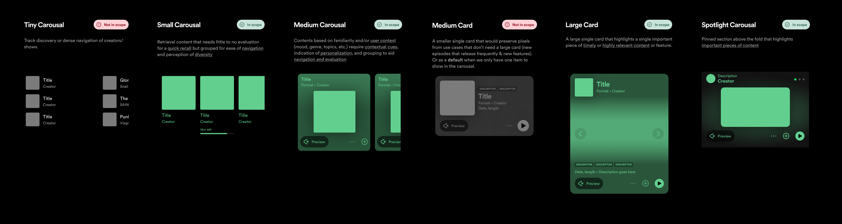
Components that were prioritized for Spring 2024
My User Researcher, ML engineerig lead, and I then worked on mapping these components back to our list of content hypotheses. We also created a decision tree that made it easy to decide which component to use for any future content hypotheses that may be created.
Decision tree for mapping content hypotheses to UI components
Working on rethinking a high-profile surface is a team effort. Throughout this experience I had to partner with PMs, User Researchers, Data Scienctists, Visual Designers, Front-End Engineers, and ML Engineers to analyze and craft the architecture, content programming, and UI. This has contributed to furthering my knowledge on how user behavior, design, and machine learning intersect on a large scale.
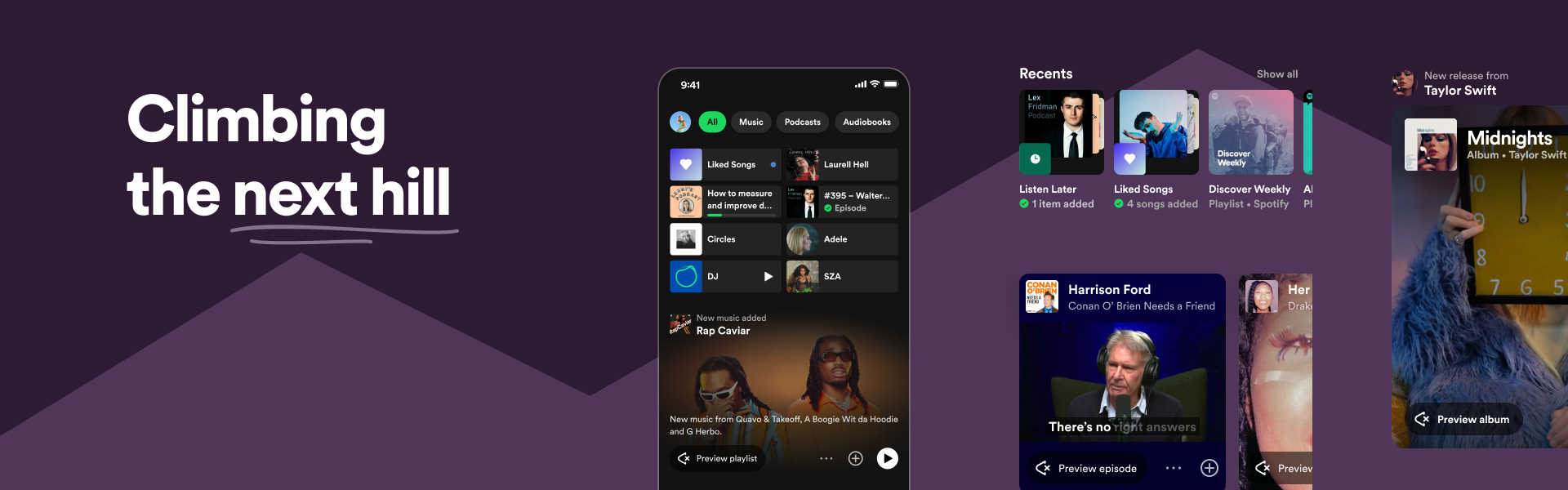
While we are still in the middle of proving out that this new vision is fundamentally better than the past one, I am confident that with changes like Hybrid Home and our new component set in the future Next Home we are moving towards the next peak.