
Senior UX Designer
Project Lead
Amazon Contact-Handling Experiences
Designs handed off
Implementation in progress
In 2019, Amazon launched Caracara—the new contact-handling tool for Customer Service Associates (CSAs) who work with solving retail-related customer calls and chats. This tools sought to improve on the lengthy time to proficiency, messy information architecture, and security & accessibility gaps in the previous legacy tool (CS Central). Caracara was widely successful in tackling these issues and improving the overall experience for Amazon Retail CSAs. As other business verticals noticed the success of this new tool, they also wanted to provide similar streamlined experience for the CSAs who handle customer contacts related to their business (ex. Digital, Device, and Alexa support and Amazon Business support). Therefore, an initiative named “Aviary” was created to extend the existing Caracara interface into a platform that could host experiences for multiple different types of CSAs and the contacts they handle.
I was the lead UX designer for figuring out how to scale the platform and develop guidelines on how businesses could migrate their content from CS Central into the new Aviary framework.
Screenshots of the legacy tool, CS Central, and the new simplified tool for retail associates, Caracara.
Our TPM did an initial audit to understand the scope of migrating all the content from CS Central. CS Central is a bloated tool that has existed for a long time, consisting of over 2000 pages owned by over 35 teams. Having this data, our UX researcher and I began digging into the most trafficked pages and setting up time with these migration teams in order to decipher patterns and understand what use cases we would need to cover in Aviary. We learned that:
We also learned some overall pain points in the CS Central architecture.
Learning from the messy and inconsistent legacy tool, we wanted to establish a clear architecture that established a federated model with clear lines of ownership. After leading discussions with PM and Tech partners, I aligned the team on 3 levels of ownership:
App
The shell app built and owned by the Aviary Framework Team used to access Solutions and Components.
Owned by the Aviary framework team
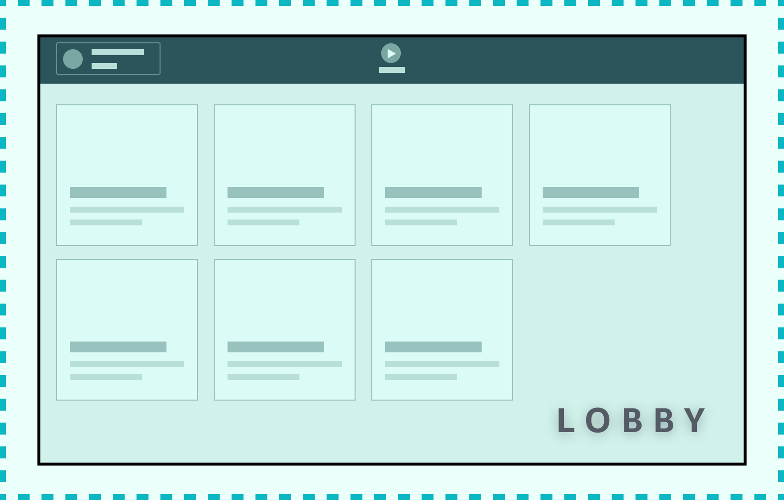
Solution
These are the collection of pages provided for specific CSA populations handling different CS workloads
Owned by a Solution Owner
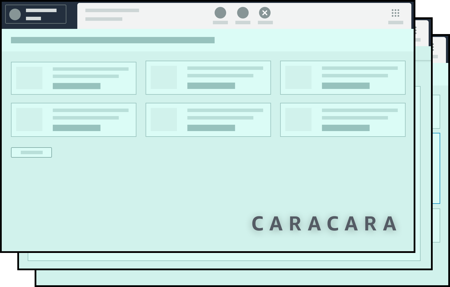
Component
A Component is a widget, card, page, modal or UI that is built as part of the Aviary shell app or is a Micro Front end that is re-rendered inside an iFrame inside of Aviary.
Owned by a Component Owner
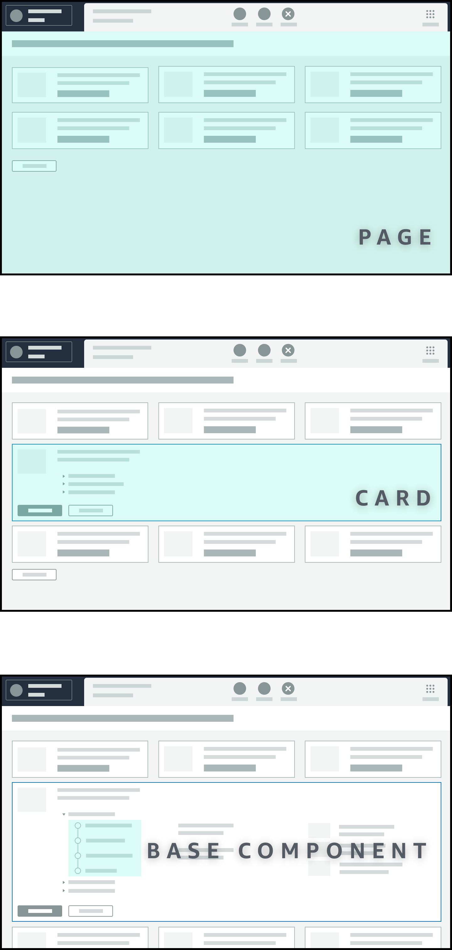
With this architecture we route CSAs to Solutions that contain only the information relevant to the customer’s issue. Having distinct components with owners also allow us to establish reusable components that deliver a consistent experience across Solutions.
Now that we had established a foundation for software ownership, I then took the findings from the audit to define various migration paths based on the types of content we had to migrate into Aviary.
Entities are the "things" the customer is calling about
Using these use cases, I then explored methods to extend the Caracara system to handle these migration needs. As I iterated on these explorations, I found that our framework was fairly similar to that of a web browser. With the Aviary app akin to a web browser and the Solutions akin to a website that the browser surfaces. Therefore we were able to borrow from a lot of web browser design paradigms. Along with establishing methods for integrating with existing components, I created various new components to allow CSAs to navigate to new types of content:
 Tabs
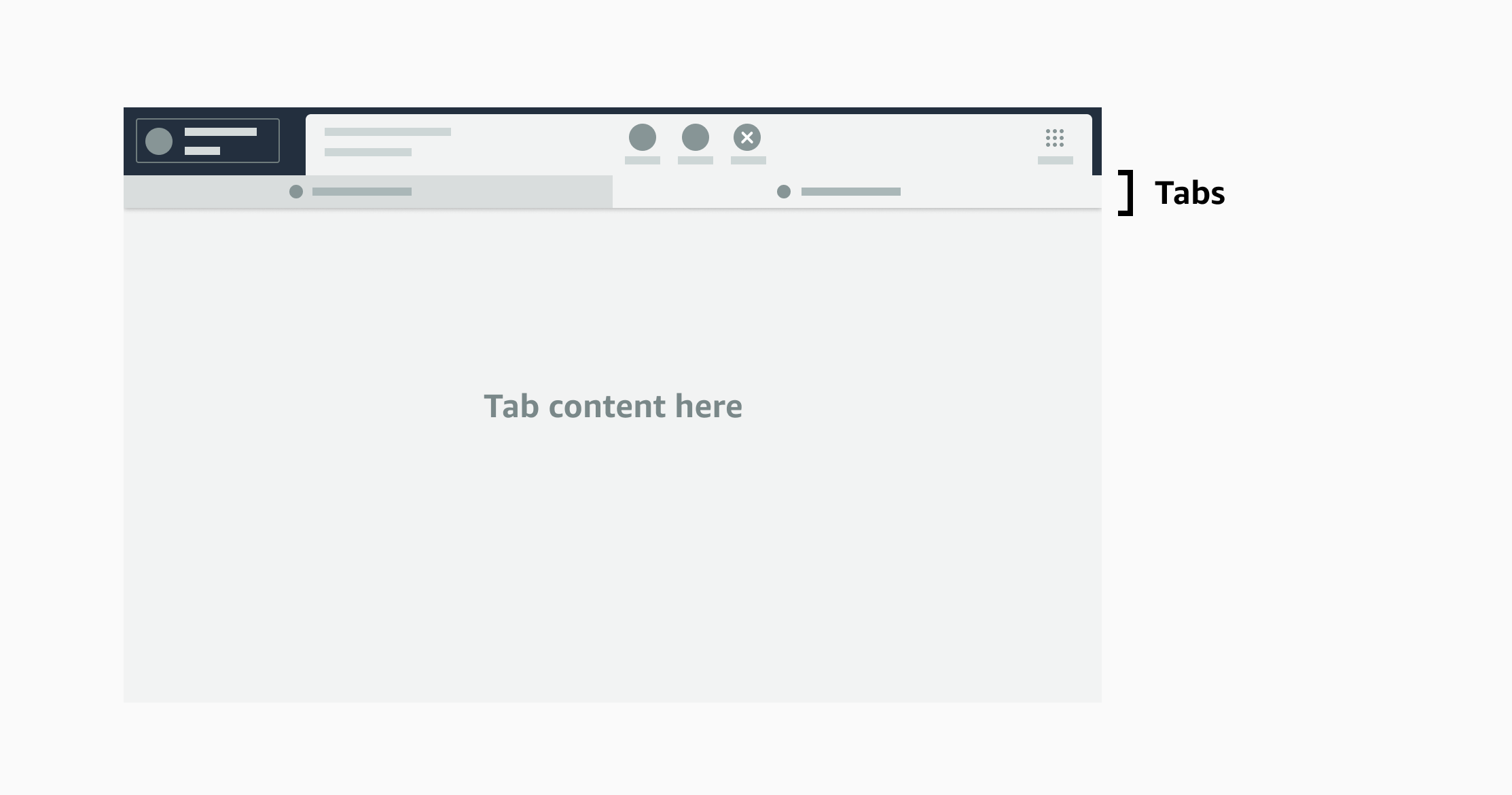
Tabs
In order to handle the CSA switching between multiple pages, I introduced tabs. Tabs can be accessed through links and cards from the landing page.
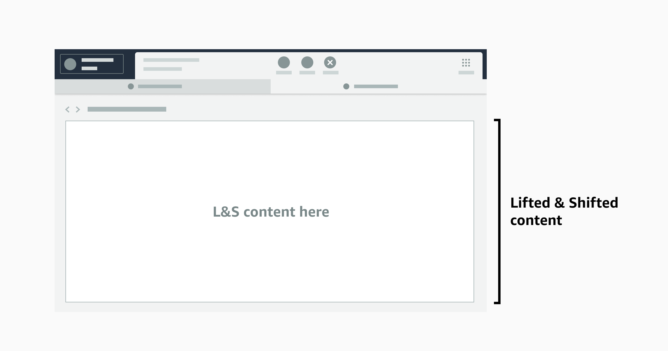 Lifted & Shifted Pages
We are aware that businesses will not be able to immediately rebuild their content using Aviary native components. Therefore, we are introducing Lifted & Shifted pages which allow builders to lift their standalone existing CS Central content as-is and present it on a new tab. This feature will be removed in the future as we start to mandate that content be built natively in Aviary.
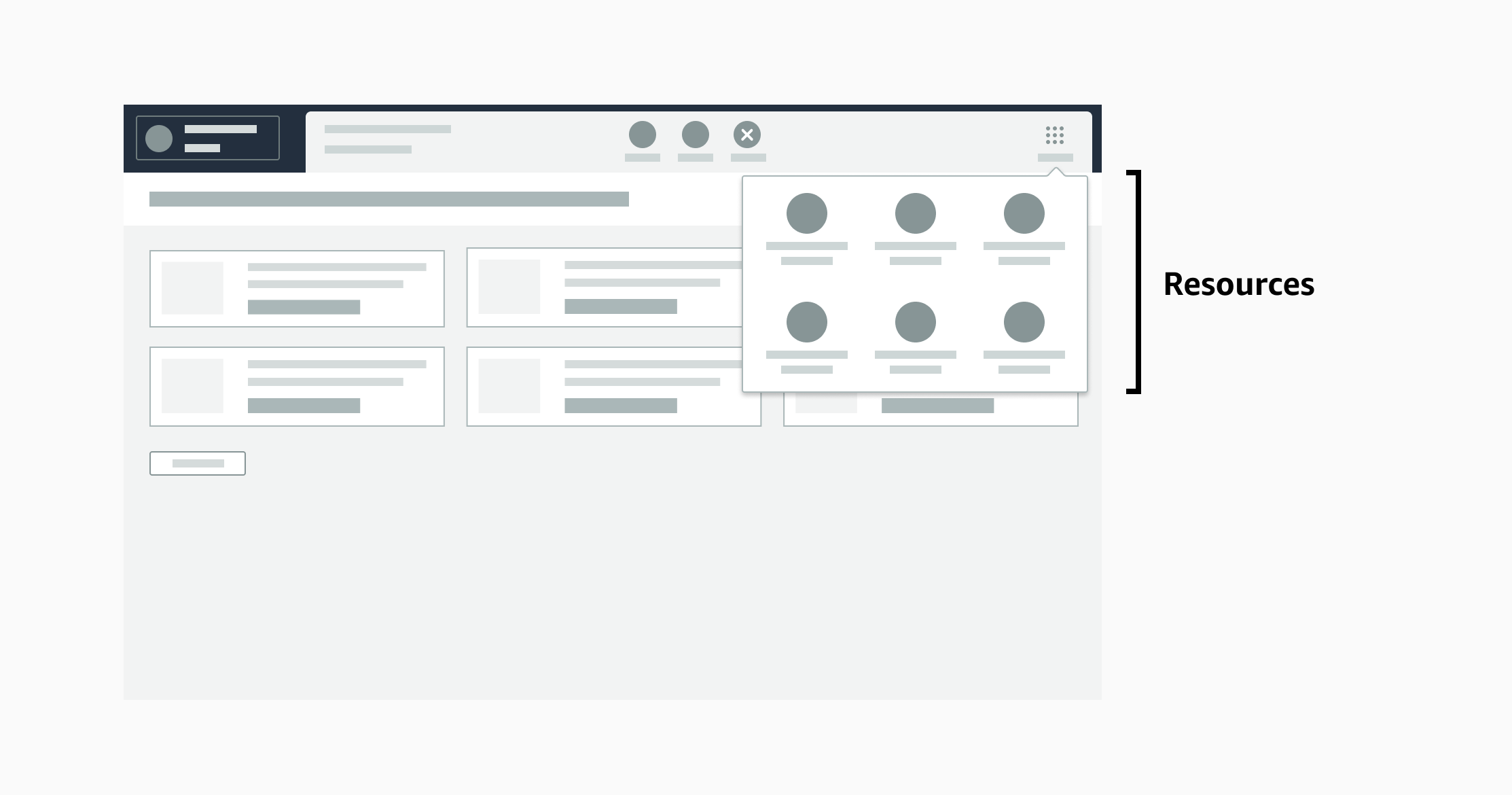 Resources Dropdown
The Resources dropdown is a drawer that stores links to tools and other resources that need to be accessed globally or is just agnostic of the specific issue the customer is calling about—like a page that shows the customer’s previous Customer Service contacts. Ideally information will always be contextual, but the Resources dropdown acts as a backup.
In order to ensure that we were building the right global navigation framework with these components, I partnered with my UX researcher to test these migration paths with users. In order to get nuanced insights about the experience, we tested with 6 CSAs who were a mix of Caracara and CS Central users, and with 6 people off the street. We test with people off the street to ensure that the experiences we build are easy to use for a day one CSA.
With the people off the street who acted as CSAs, we found that they were able to easily understand and use the new patterns I had built. However, an interesting finding was that CSAs who were familiar with CS Central struggled a bit to find the right information on their first try. However, once they discovered it, they were able to immediately use it the second time—so the experience is easily learnable, which is a good result for a tool that is used by someone for their job every single day. When we deep-dived into this we found that CS Central had left a mark on its CSA users—leaving them deeply entrenched in dark patterns that had been erased in the new Aviary framework. Thus, retraining will be very important as we move tenured CSAs to our new system.
A demo of the Aviary migration components I created
As the results of my work were integral to being able to coordinate and educate other businesses about the planned migration, I spent a lot of my time presenting these migration paths to other teams—starting from our VP of Customer Service and their leadership team, to broadcast videos for our CSA population, and all the way down to the teams who owned a small piece of a single component.
In order to further empower builders on other teams, I created detailed documentation of migration strategies and visualizations and other artifacts to explain key ideas (software ownership architecture, component types, reusability patterns, the difference between etc.). I also created a Figma component library that contained the new Aviary components and templates to enable designers on other teams to start designing their Aviary experiences
An example artifact for builders to understand how to migrate